October 3, 2023
Custom layout with Flutter
Aloïs Deniel

Flutter provides a large library of widgets dedicated to layout: Row, Column, Stack, Padding, and many others.
Sometimes, even with this large choice, you can't implement your layout, or you could but it would become far too complex.
Fortunately, Flutter provides a widget that gives you a bit more freedom: CustomMultiChildLayout.
An example layout
I'll give you an example layout that is a bit more complex than it seems to implement at first: a simple title bar.
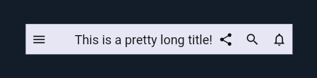
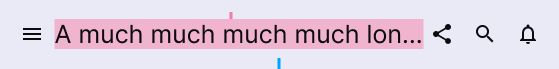
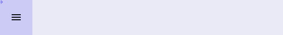
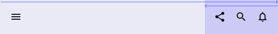
Imagine that you want to build a title bar like the following one:
At first, you would think "Easy peasy! I'll use a Row and Stack and that's it!". But let's specify a bit more the component in order for you to grasp the underlying complexity.
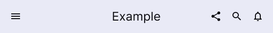
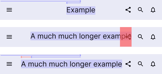
First, We want this title to be ideally centered horizontally on the screen.
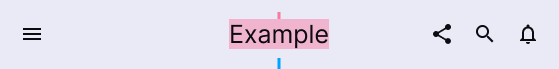
Now what if this centered title becomes long enough that it overlaps with the buttons on the right or left? In this case, we want the title to be translated in the nearest position from the center, in the available space.
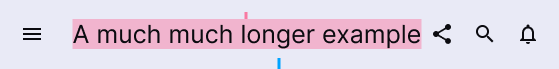
And if the text becomes really too large to be displayed, then we want it to end with ellipsis.
If you think about all these constraints, then you might start to understand that it is tricky to implement with the common layout widgets.
Implementing a custom layout
To implement this toolbar I ended up with a custom layout (if you know a simpler way don't hesitate to reach me out!), with the CustomMultiChildLayout. I was going to go with a custom render object implementation until Romain reminded me about this widget.
This widget isn't as popular as many others, but it might save you a few dozen lines of code: it allows you to layout and position a set of children widgets with a simple delegate.
The CustomMultiChildLayout requires you to define a unique identifier for each one of its children, by wrapping it in a LayoutId widget.
In our case, we will define three children : leading actions, title centered text, and trailing actions.
enum _LayoutId {
  leading,
  title,
  trailing,
}

class TitleBar extends StatelessWidget {
  const TitleBar({
    super.key,
    required this.title,
    required this.leading,
    required this.trailing,
  });

  final Widget title;
  final Widget leading;
  final Widget trailing;

  @override
  Widget build(BuildContext context) {
    return CustomMultiChildLayout(
      children: [
        LayoutId(
            id: _LayoutId.trailing,
            child: trailing,
          ),
        LayoutId(
          id: _LayoutId.title,
          child: title,
        ),
        LayoutId(
            id: _LayoutId.leading,
            child: leading,
          ),
      ],
    );
  }
}
The widget also requires a custom delegate which is reponsible for positioning the children. It will contain all of the custom layouting logic.
First create a new class which inherits from MultiChildLayoutDelegate. This delegate must implement two methods :
performLayoutwhich contains our custom layout logic, andshouldRelayoutwhich allows to indicates whether the layou logic should be executed again from the last time.
class _LayoutDelegate extends MultiChildLayoutDelegate {
      _LayoutDelegate();

      @override
      void performLayout(Size size) {
         // Custom layout logic
      }

      @override
      bool shouldRelayout(covariant _LayoutDelegate oldDelegate) {
        return false;
      }
    }
In our example, we will only implement performLayout since our layout logic only depends on children sizes, which, if they change, triggers a new layout pass by default. If we would have added the directionnality for example, we would check a change in the shouldRelayout method implementation.
Now, let's dive in the core implementation of this method.
The delegate works just like the Flutter engine : it requires you to first calculate the size of each one of the children, before positionning them.
Calculating sizes
It is important to define an order here, dependening on the expected results.
In our example, the title size is dependent on the available space: the leading and trailing sizes must be calculated first and then the title.
To perform layout calculation on a child, we're using the layoutChild method. You give the child identifier and its constraints, and the framework calculate the resulting size of the child.
void performLayout(Size size) {
      final leadingSize = layoutChild(
          _LayoutId.leading,
          BoxConstraints(
            maxHeight: size.height,
            maxWidth: size.width,
          ),
       );
    }
Once we have calculated sizes, we can use it to layout other children as well. Our trailing widget won't have all the original size available, but only the space not already taken by the leading widget.
final trailingSize = layoutChild(
      _LayoutId.trailing,
      BoxConstraints(
        maxHeight: size.height,
        maxWidth: size.width - leadingSize.width,
      ),
   );
And finally we know which maximum remaining width we have for the title.
final titleSize = layoutChild(
      _LayoutId.title,
      BoxConstraints(
        maxHeight: size.height,
        maxWidth: size.width - leadingSize.width - trailingSize.width,
      ),
    );
Position the children
Now that we know each child size, we're able to position them with the positionChild method with the id and the coordinates of the child.
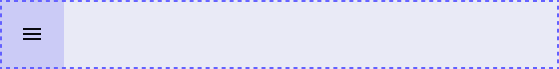
Our leading widget is pretty easy to position since it is always located at the start position. We just make sure to align it vertically.
final center = size.center(Offset.zero);
positionChild(
  _LayoutId.leading,
  Offset(
    0,
    center.dy - leadingSize.height / 2,
  ),
);
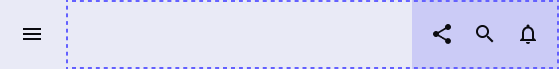
The trailing widget is also easy since it is positioned at the end of our layout.
positionChild(
   _LayoutId.trailing,
   Offset(
     size.width - trailingSize.width,
     center.dy - trailingSize.height / 2,
   ),
 );
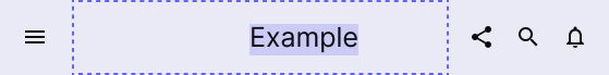
Finally, the reason why we've done all of this so far: the title aligning logic.
We calculate the overlapping amounts, and we position our title accordingly.
final leadingOverlapping =
    leadingSize.width // leading end
    -
    (center.dx - titleSize.width / 2); // title start
final trailingOverlapping =
    (size.width - trailingSize.width) // trailing start
    -
    (center.dx + titleSize.width / 2); // title end

positionChild(
   _LayoutId.title,
   Offset(
        math.max(0, leadingOverlapping) +
          math.min(0, trailingOverlapping) +
          center.dx -
          titleSize.width / 2,
        center.dy - titleSize.height / 2,
   ),
);
That's it... our layout is ready to be used!
Using the layout
In the first step we put our custom layout in a TitleBar dedicated widget, to simplify its usage.
So, we're now able to instantiate a TitleBar with our children.
const TitleBar(
    title: Text(
        'Title',
        maxLines: 1,
        overflow: TextOverflow.ellipsis,
        style: TextStyle(
            fontSize: 20,
            color: barForeground,
        ),
    ),
    leading: TitleAction(Icons.menu),
    trailing: Row(
        mainAxisSize: MainAxisSize.min,
        children: [
            TitleAction(Icons.share),
            TitleAction(Icons.search),
            TitleAction(Icons.notifications_none),
        ],
    ),
)
All the code is available as a DartPad if you want to try the result!