November 25, 2020
Designing truly adaptative user interfaces
Aloïs Deniel
This week, I presented a session at the FlutterVikings Conference, where I explained what you should worry about when building your Flutter user interfaces (the video recording is available on YouTube).
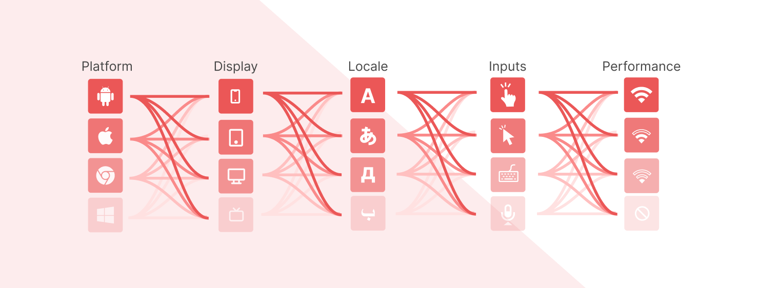
One of the strengths of Flutter is its support for a wide range of targets. But supporting them doesn't mean that everything is automatic. I will try to give you an overview of what is important when developing an application for many users. I won't go too much into each topic, so feel free to explore each one on your own.
What is Adaptative Design?
There's no clear definition of adaptative design, but I chose this term to contrast with another one we often come across : responsive design.
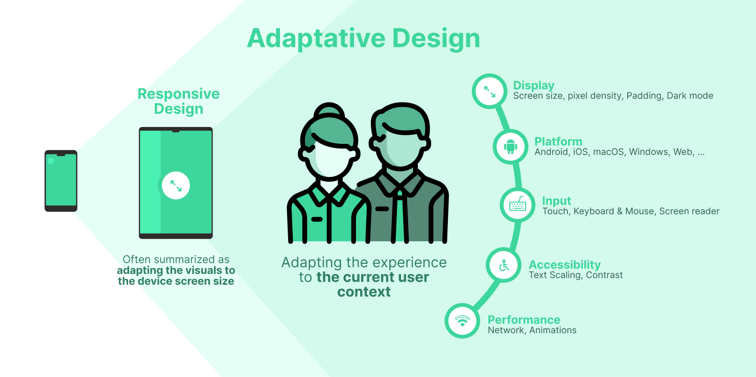
Responsive Design definitions often refer to how the layout of our user interfaces should be adapted to the size of the screen. This definition emerged with the web, where the variety of targets was less important compared to today's mobile various form factors.
Mobile devices introduced a lot of new use cases. The users have devices with multiple screen specificities, but in addition :
- apps can now run on different operating systems with different experiences
- users can interact in different ways with your app: touch gestures, trackpads, mouses, voice, ...
- the accessibility parameters are much more numerous
- the performance isn't always guaranteed: the user can lose his network connection for example.
Fortunately, Flutter provides all the tools needed to take care of that, and to give your users the best-adapted experience for their own usage.
Platform
Knowing the operating system on which your app is currently running allows you to enhance the experience for this particular platform, and makes the user feel more at home.
The most basic way to detect the platform is through the Platform class. Since the web target has a different build system, you may have to test against the kIsWeb constant too.
import 'dart:io';
import 'package:flutter/foundation.dart';

@override
Widget build(BuildContext context) {
    if(kIsWeb || Platform.isMacOS || Platform.isLinux || Platform.isWindows) {
        return DesktopLayout();
    }

    return MobileLayout();
}
The Flutter team delivers two libraries of widgets to help you adapt the visuals of your application.

In addition to the well-known Material design system that comes with Android, the Cupertino package mimics a lot of the native iOS UI components. Using those components may help you to provide the most fluent experience for your iOS users.
Unfortunately, there's no Windows, macOS, Linux library yet, but nothing stops you to build your own design system which may be the easiest solution to adapt your interfaces.
Display
The screen of the device is probably the most important factor when it comes to adapting your user interface, and this screen may have a lot of different form factors.
MediaQuery
You probably already used the MediaQuery before when developing with Flutter. For sure, that's because MediaQuery gives you access to a lot of properties describing the current user context.
Since it is an InheritedWidget, you have access to it from anywhere in your widget tree. And if you're not familiar with this kind of widget (I highly recommend you to watch the video from the Flutter 101 series), any child widget from the tree that reads the InheritedWidgets data will get rebuilt automatically every time the data changes!
@override
Widget build(BuildContext context) {
    final mediaQuery = MediaQuery.of(context);
    // Rebuilt every time a property of media query changes
    // ...
}
Screen size
Whatever the platform, the screen is the main way of giving information to your users, and this screen can take various sizes. It is more true than ever if you also support desktop targets where the application window can be dynamically resized.
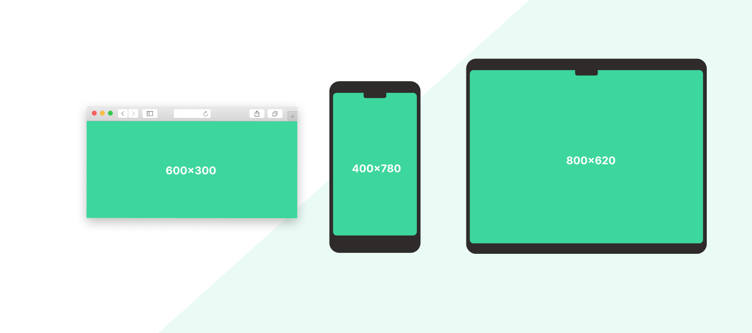
To read the current size of your application Window, use the size property from the MediaQuery. Again, if the size of the window changes, your build method gets called again automatically.
@override
Widget build(BuildContext context) {
  final size = MediaQuery.sizeOf(context);

  if (size.width > 1024) {
    return LargeLayout();
  }

  if (size.width > 332) {
    return MediumLayout();
  }

  return SmallLayout();
}
You can now provide various layouts regarding the width of the screen: displaying a side menu (or rail) on a large screen, and a bottom tab bar on smaller ones for example.
Screen density
Less often used, reading the screen density can help you refine your app for several devices.
Each screen has a dedicated pixel density. To give you an idea of what is screen density, I would describe it as how many pixels can you put in a physical space of your screen (for example a square of 1 inch by 1 inch).
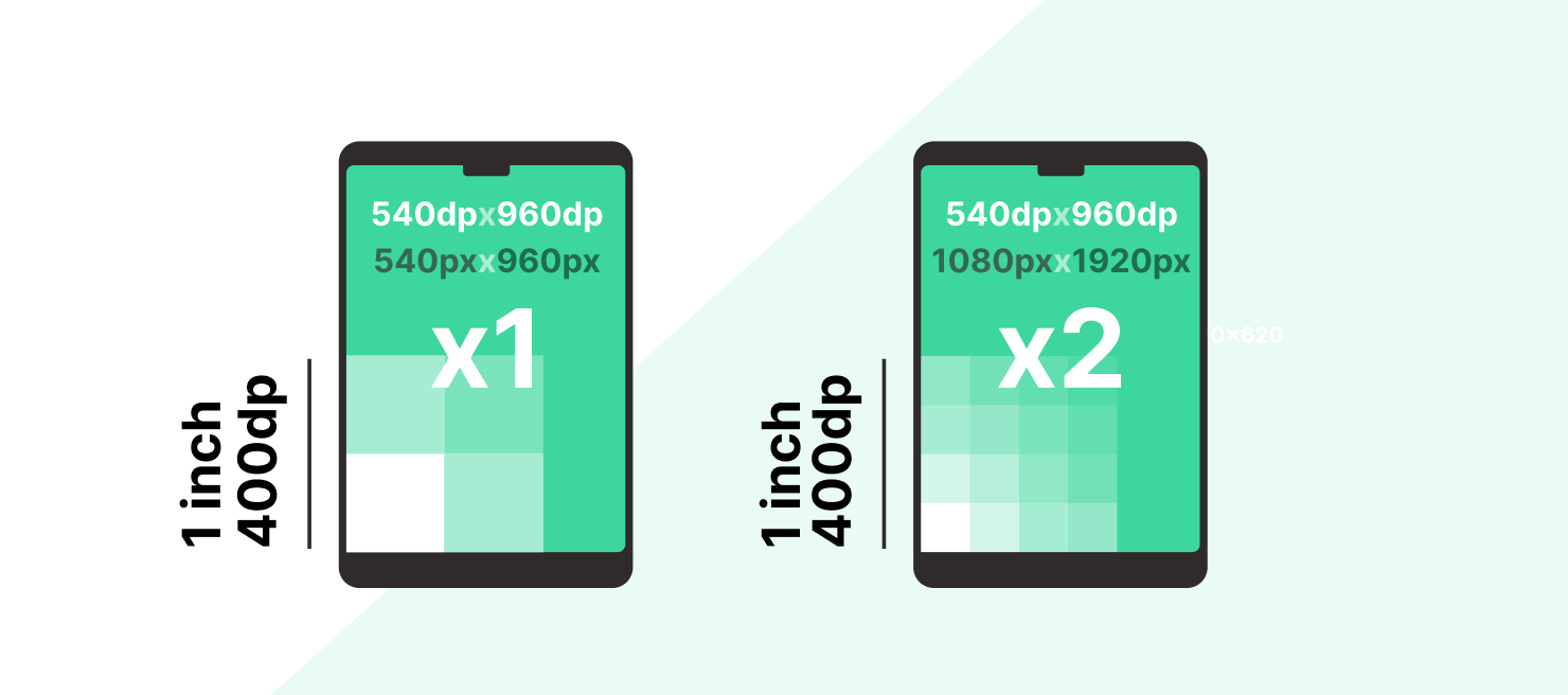
For two devices with the same physical screen dimensions, one may have four times as many pixels.
This density is called the devicePixelRatio from the MediaQuery.
@override
Widget build(BuildContext context) {
    final devicePixelRatio = MediaQuery.devicePixelRatioOf(context);

    if (devicePixelRatio >= 2) {
      return HighDefinitionVideo();
    }

    return LowDefinitionVideo();
}
A use case for example : you can save network bandwidth by delivering a video from the network in a lower definition for devices with smaller densities since they won't see the difference with an HD video.
View padding
Nowadays, more and more devices have a notch "thanks" to Apple, and we have to adapt our UIs against them too. If we don't, information can be hidden behind those notches, or even bad, an interaction like a button may be obscured.
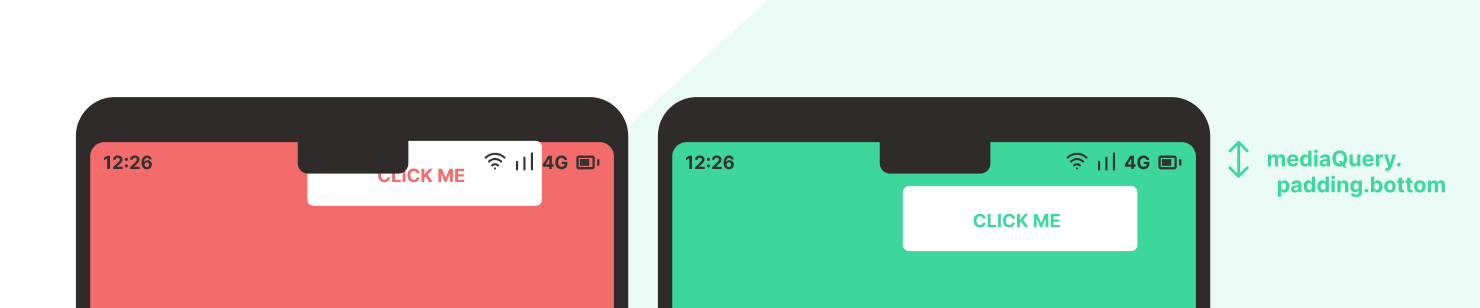
To know which areas of the screen are obscured with notches, or round corners, read the padding property from the MediaQuery.
@override
Widget build(BuildContext context) {
  final padding = MediaQuery.paddingOf(context);
  return Padding(
    padding: EdgeInsets.only(
      top: padding.top,
    ),
    child: Child(),
  );
}
Flutter also gives you a widget to help you with this task : SafeArea.
@override
Widget build(BuildContext context) {
    return SafeArea(
      left: false,
      right: false,
      bottom: false,
      child: Child(),
    );
}
Another issue can raise with the software keyboard. In the same way, use the viewInsets property to add the needed margins. The Scaffold automatically manages this for you, but it may be useful to deal with it directly sometimes.
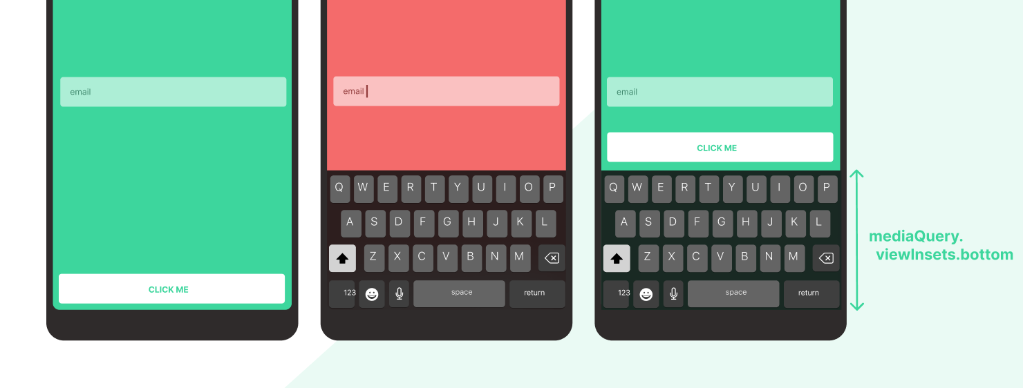
@override
Widget build(BuildContext context) {
    final viewInsets = MediaQuery.viewInsetsOf(context);
    return Padding(
      padding: EdgeInsets.only(
        bottom: viewInsets.bottom,
      ),
      child: Child(),
    );
}
Accessibility settings
Forgotten most of the time, the user can activate settings system-wide to improve the text readability for his needs. That's generally available from the accessibility settings, and he is able to modify the default text scaling factor, and to active bold fonts.
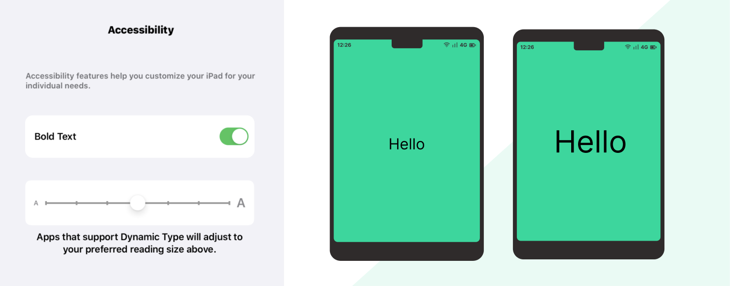
Guess what, again, those two properties are available from the MediaQuery :
  Widget build(BuildContext context) {
    final textScaleFactor = MediaQuery.textScaleFactorOf(context);
    final boldText = MediaQuery.boldTextOf(context);
    return Text(
      'Hello!',
      textScaleFactor: textScaleFactor.clamp(1.0, 1.5),
      style: TextStyle(
        fontFamily: boldText ? 'LightFont' : 'BoldFont',
      ),
    );
  }
The Text's textScaleFactor value is mediaQuery.textScaleFactor by default, so make sure to try updating those settings while developing your app to make sure that your layouts aren't broken.
Dark mode
Since Android and iOS now allow to activate a dark mode, more and more applications offer a dark alternative for their user interface. This feature seems to be very popular with users, and it adds a touch of personalization. So if you have the possibility to add a dark alternative, do it!
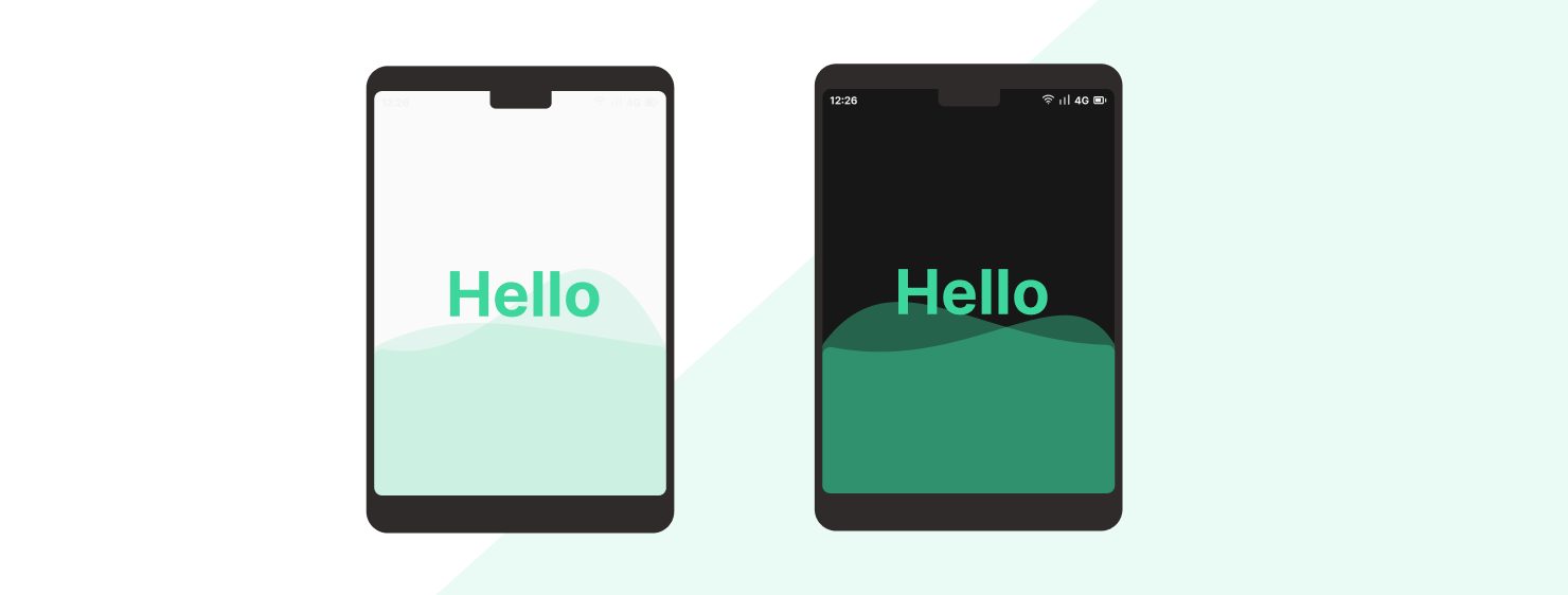
One more time, the platformBrightness is available from the MediaQuery.
 @override
  Widget build(BuildContext context) {
    final platformBrightness = MediaQuery.platformBrightnessOf(context);
    return Image.asset(
        platformBrightness == Brightness.dark
          ? 'assets/background_dark.png'
          : 'assets/background_light.png',
    );
  }
If you're using a MaterialApp you can also provide a lightTheme and darkTheme to automatically adapt the built-in material components.
Internationalization
What could be more obvious than taking into account the user's language to create an adapted user interface?
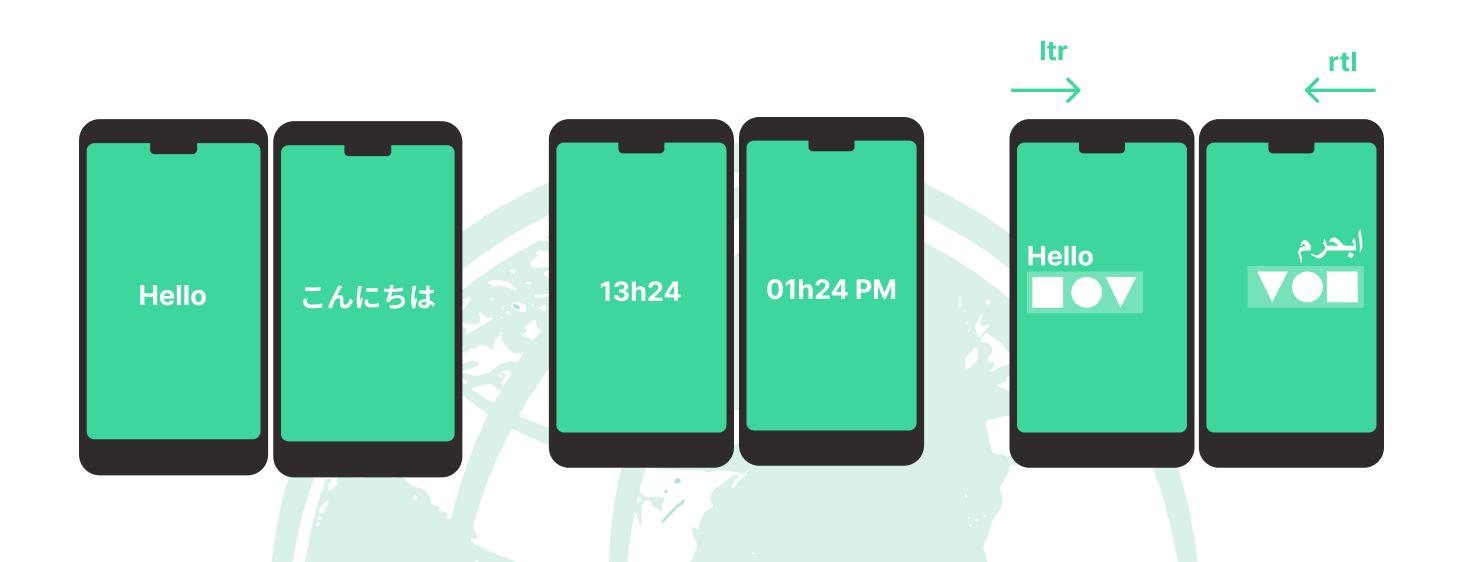
Be sure to create variations of your content for multiple regions of the world to grow your audience. To do this, Flutter has integrated support for Local which contains information about the user's language and country.
To access the current user locale, use the Localizations inherited widget :
@override
Widget build(BuildContext context) {
  final locale = Localizations.localeOf(context);
  return Image.asset('flag_${locale.countryCode}.png');
}
To internationalize the labels of your app, make sure to add a reference to the intl package. It comes with a lot of helpers too like the DateFormat.
@override
Widget build(BuildContext context) {
  final locale = Localizations.localeOf(context);
  final formattedDate = DateFormat.yMMMMEEEEd(locale.toString());
  return Text(formattedDate);
}
Finally, another thing you may have to try regularly if you support a right-to-left written language: all widgets based on Directionality will be adapted to this orientation configuration, like Row. So make sure your layout is correct with an rtl orientation too, as they will be updated automatically with language changes.
You can access the direction manually if you need to :
@override
Widget build(BuildContext context) {
  final direction = Directionality.of(context);
  return Image.asset('horizontal_illustration_${direction.value}.png');
}
User inputs
An application is a bidirectional interface. It is not enough to simply adapt the information presented to the user, you must also adapt the way the user will interact with your application to provide the best possible experience.
Voice readers
By supporting voice readers (that are enabled from system settings), you allow users with disabilities to interact with your application with their voice.
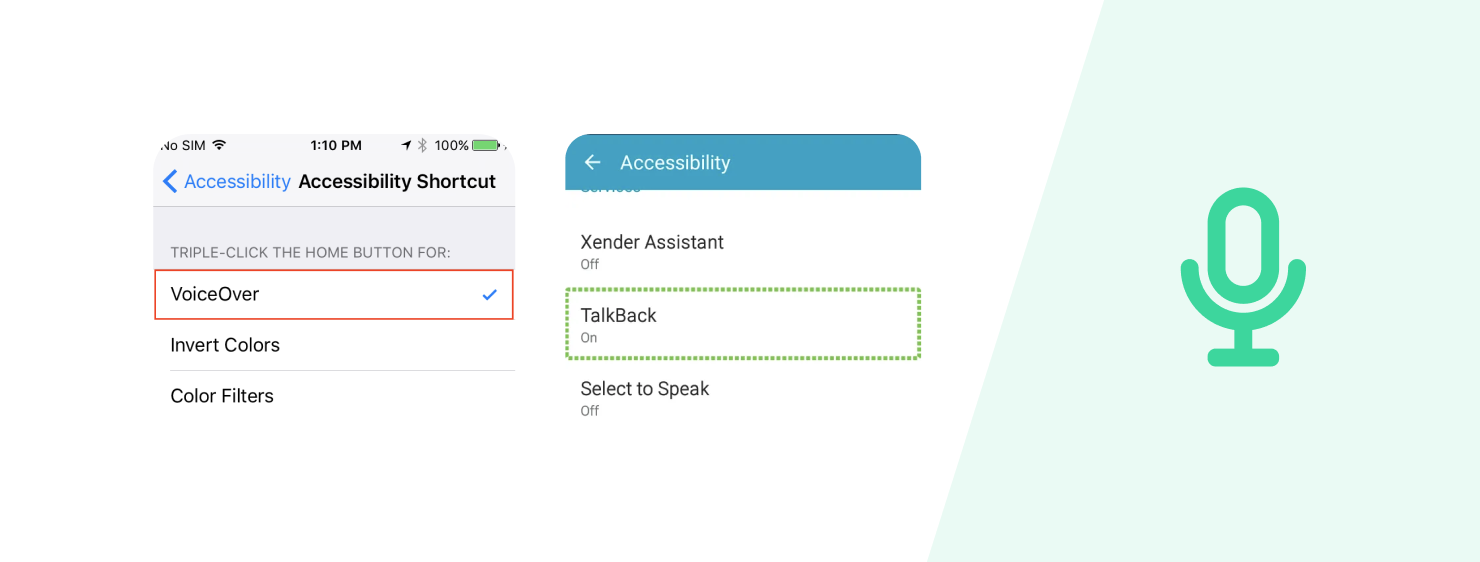
To support voice interractions, Flutter provides the Semantics widget. If you want to describe a visual area of your screen, simply wrap your widget into a Semantics with the details.
@override
Widget build(BuildContext context) {
  return Semantics(
    button: true,
    label: 'My awesome button',
    child: Child(),
  );
}
Fortunately, all the default Flutter widgets already provides semantics out of the box, or at least ways to customize from the widget level.
Keyboard & Mouse
Now that desktop support becomes a reality with Flutter, and iOS supports trackpad, the combination of keyboard and mouse is very important for users. It is often a way to improve productivity by adding shortcuts or having better pointer precision.
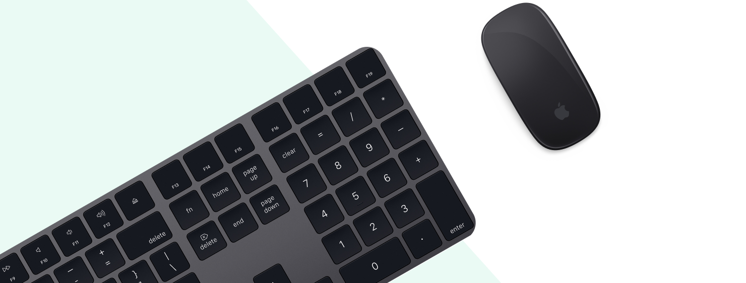
The Flutter team as already designed widgets for those use cases, and one of the most useful is the Shortcuts one which obviously allows you to trigger callback when combinations of keyboard inputs are pressed.
return Shortcuts(
  shortcuts: {
    LogicalKeySet(
      LogicalKeyboardKey.control,
      LogicalKeyboardKey.keyC,
    ): CopyIntent(),
  },
  child: Actions(
    actions: {
      CopyIntent: CallbackAction<Intent>(
        onInvoke: (intent) => copy(),
      ),
    },
    child: Child(),
  ),
);
If you want the raw keyboard input, use the RawKeyboardListener instead.
To detect a mouse pointer, use the MouseRegion widget which provides various callbacks :
@override
Widget build(BuildContext context) {
  return MouseRegion(
    onEnter: (event) => print('Enter'),
    onExit: (event) => print('Exit'),
    onHover: (event) => print('Hover'),
    child: Child(),
  );
}
Keep in mind that mouse pointers are much more precise than touch gestures: this is an opportunity to reduce the size of the areas of interaction in order to display more content to the user. This is what the VisualDensity does in the MaterialApp.
Performance
Finally, several things doesn't depends on the user himself, but on its device and context.
Connectivity
In a mobile context, the status of the network may vary a lot, and it can go from a wifi connection that is able to deliver a lot of streaming content, to a less performing mobile connection, or even worse, to an offline status.
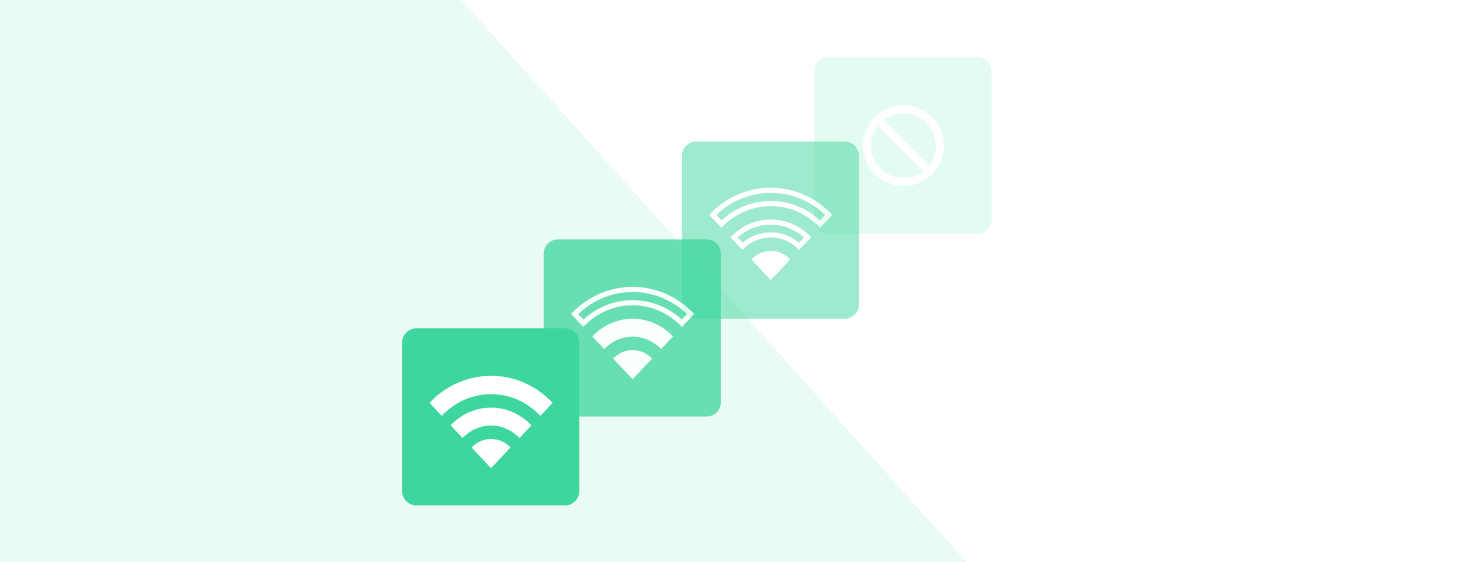
It is very important to anticipate all these cases and give the user feedback to improve his experience regarding this connection state. Fortunately, there is a plugin to observe these network state changes: Connectivity.
final connectivity = Connectivity();
final initialState = await connectivity.checkConnectivity();
updateIsOffline(initialState);
await for (var stateUpdate in connectivity.onConnectivityChanged) {
  updateIsOffline(stateUpdate);
}
Providing an offline mode can take a lot of effort, but it is a major improvement for the user.
Animations
Even if it isn't actually possible to test the rendering performance of the device, the user can disable animations from his system settings. This may be for accessibility reasons, but also for performance reasons. So it may be important to adapt the transitions and animations of your app based on this setting.

The disableAnimations property is available from the MediaQuery :
@override
Widget build(BuildContext context) {
  final disableAnimations = MediaQuery.disableAnimationsOf(context);
  return disableAnimations ? StaticChild() : AnimatedChild();
}
Tips to improve adaptability
I will finish by giving you several pointers to help you with making your application adaptable.
1) Anticipate adaptability
Even if your application supports only one form factor at first, make sure you configure everything to support adaptability later on. It's worth it in many cases, because introducing adaptability by refactoring an entire code base is no fun, believe me.
2) Avoid constants
Try to remove all constants from your widget code. All constants, whether they are font sizes, paddings, colors should be avoided and inherited widgets used instead as much as possible!
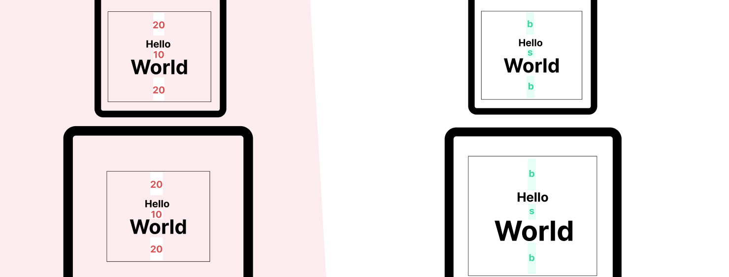
For example, if your view is designed like below, the UI will stay the same if the user changes the window size, and there's no easy way to adapt it.
@override
Widget build(BuildContext context) {
  return Padding(
    padding: EdgeInsets.only(
      top: 20,
      bottom: 10,
    ),
    child: Text(
      "Hello",
      style: TextStyle(
        fontSize: 10,
      ),
    ),
  );
}
One way to improve this is to define a data class that centralize all this properties, which is provided to the widget tree through an InheritedWidget.
class AdaptativeTheme {
  final double bigSpace;
  final double smallSpace;
  final double smallFontSize;
  const AdaptativeTheme({
    @required this.bigSpace,
    @required this.smallSpace,
    @required this.smallFontSize,
  });
}

@override
Widget build(BuildContext context) {
  final theme = Provider.of<AdaptativeTheme>(context);
  return Padding(
    padding: EdgeInsets.only(
      top: theme.bigSpace,
      bottom: theme.smallSpace,
    ),
    child: Text(
      localization.hello,
      style: TextStyle(
        fontSize: theme.smallFontSize,
      ),
    ),
  );
}
You're now able to update the padding and font size by observing media query and providing various themes.
@override
Widget build(BuildContext context) {
  final isSmall = MediaQuery.of(context).size.width < 500;
  return Provider.value(
    value: isSmall
        ? AdaptativeTheme(
            smallFontSize: 10,
            bigSpace: 20,
            smallSpace: 10,
          )
        : AdaptativeTheme(
            smallFontSize: 20,
            bigSpace: 40,
            smallSpace: 12,
          ),
    child: Child(),
  );
}
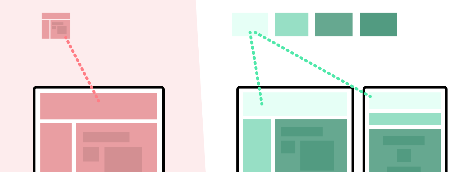
3) Split your widgets
You should avoid monolithic widgets with gigantic build methods, because it makes them not composable at all. Force yourself to split you build methods into many small widgets so that they can then be easily composed to create various layouts. And as a bonus it also results in better performance!
4) Try Device Preview
After reading all of this, you may wonder how difficult it is to test the adaptability of your application.
Pluging devices, setting system preferences, changing locale, ... all of this takes a lot of time.
That's why I decided to create a Flutter package to help with that : DevicePreview. Its a simple widget that wraps your whole app and allow to override the mediaquery to test all its specificities. It also gives you a preview of how your app will perform on well known devices.
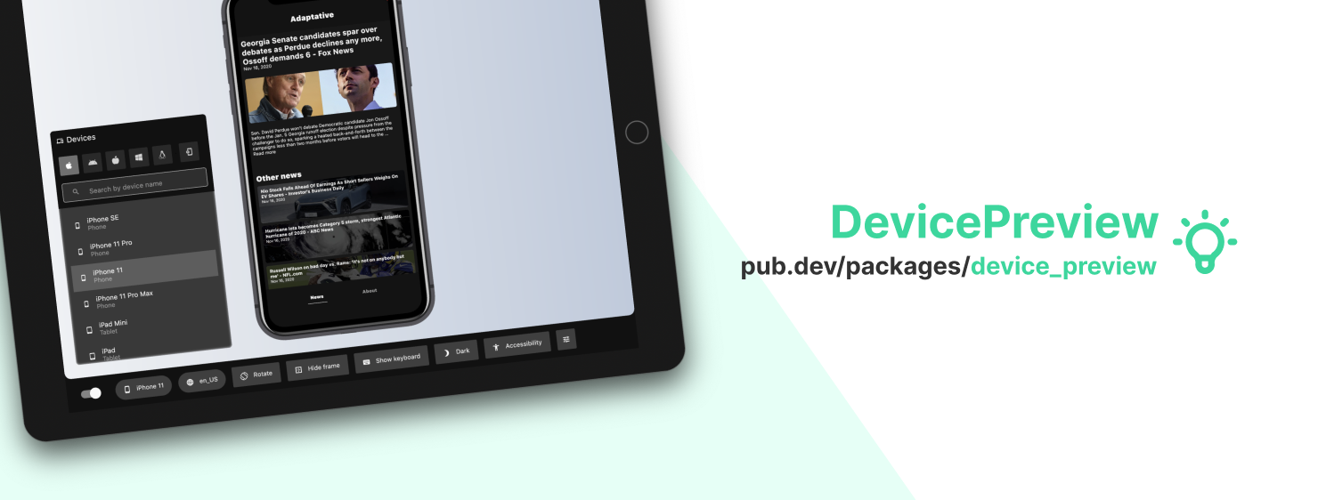
DevicePreview is open source, so feel free to give us your feedback to help me improve it!
Conclusion
This was only the tip of the iceberg, but I hope it makes you realize that building a real application may have a lot of caveats that are always a lot easier to overcome when anticipated.
I hope you enjoyed this, since it is just an adaptation of what I presented at the FlutterViking conference, I also hope that it wasn't too boring given the enumeration.
See you soon!